

People often think that branding and the visual identity of a company are one and the same. However, real branding goes beyond the visuals. Instead, branding expresses what a company (and its products/services) is all about. Yes, some aspects of it may be visual, but in reality, it is a complex concept that just can’t be confined in a singular medium.
Still, what we see is what we believe. No matter the misconception, visual design plays an immense role in branding companies. In this age where audiences thrive in digital spaces, web design is one of the ways a company can reach out to their targets and establish their brand.
For graphic designers, there are rules governing functional design that must be followed. As true artists will tell you, though, you’re not pushing frontiers when you’re not breaking rules. Here are the ways your company can express itself by breaking rules.
Be consistent with your branding.
Being consistent lets your audience recognise your company in the midst of an oversaturated digital world. However, being known for constantly changing and keeping up with the times could also be a branding strategy.
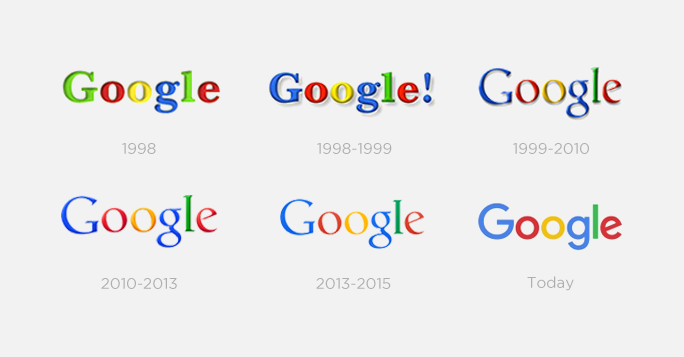
The best example for breaking this rule is one of the (if not THE) biggest brands on the internet, Google. Google keeps up with the times and constantly reinvents its brand. Experimenting with textured/skeuomorphic design during its early years before eventually transitioning into flat and clean design, it has changed a lot, but is still generally recognisable. Even its logotype changes every so often to reflect events, celebrations, and trends.
Design with your consumers in mind.
If you want to get closer to your consumers, you have to keep them in mind when designing your brand. As a rule, you have to find what stimulates them, what represents your company, and where those lines intersect.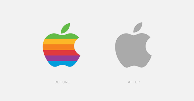
In breaking this rule, no brand has done it better than Apple. Apple didn’t pander to their consumer’s needs. Instead, it carved its own path during the iPod/early iPhone era and created something so massive that the market gravitated to - and in many ways, revolved around - them. In the context of their design, during that period, their website started a minimalistic revolution that others have since imitated. Their aesthetics, both in their products and in their branding, were on a whole new level and created a tech demand in a way no other company had done before.
Limit your use of colors.
Most designers stick to a few colors or a defined color scheme for branding purposes. After all, colors are the easiest way to bring your brand to mind. Great examples include:
-
Coca-Cola and their red and white stripes;
-
Kodak and its proprietary Kodak yellow;
-
Cadbury and its use of purple; and
-
Facebook and blue
Windows’ visual identity may be breaking this rule, but it’s easy to see that it’s working out for them. Using various colors but keeping other consistent visual elements, Windows embraces diversity and preferences in their visual branding. 
In between your headlines and body texts, stick to 2-3 fonts.
For brands that rely heavily on their content, fonts and their arrangement play a huge role in making a mark on their audience. Nuances in typography and fonts mean a lot to readers. As such, it’s important for your branding efforts to be consistent in using as few fonts as possible to make it easier for your audience to read your content.
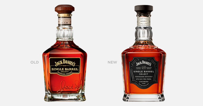
Jack Daniel’s either doesn’t know about this rule or doesn’t care about it. Thanks to the brand’s minimalistic use of colors and other design elements, their distinctive use of various fonts on their products and collaterals just work.
Bonus:
You need design.
Design attracts your audience and expresses what your company is all about. Without it, you run the risk of not getting enough attention and wasting the opportunity that the digital media provides.
It’s a curious thing, but sometimes some companies don’t need any design at all. Craigslist, reddit, 9gag and even the infamous 4chan are proof that having barebones websites could also work. However, the services that these sites provide are aligned to their design principles (or lack thereof). Instead of reminding their audience about their brand, they make their audience focus on what they offer - a space where their audience can interact and be themselves.
Need help in designing your website to reflect your company’s branding? Schedule a free consultation with our team of marketing experts and find out how we can help you.


Comments