If this is your first time to create a mobile landing page, you have to remember that people visit websites through mobile devices for different reasons than they do on desktops or laptops. I myself would rather do my finances on a desktop than look at cute dog videos, even if it’d have a larger screen—those are best watched on mobile. At least thrice. Who doesn’t like to look at cute dogs at the end of a rough day?
This is our first of two blogs on making the most of your mobile landing pages. We’re starting out with three rules of thumb for getting your LPs into shape:
Keep it super short
In two important ways: in terms of visuals and the focus.
Keeping the page short in terms of visuals means limiting its dimensions—because phone screens themselves are short, mostly from five to six inches. Don’t make your readers scroll too far down. It’s quite tiring to scroll ten times just to find what you’re looking for!
My personal rule is make sure a user wouldn’t have to scroll more than three times, depending on exact screen size. After all, your landing page should have only the essentials.
This is where keeping it short in terms of focus comes into play. Remember, your readers are on mobile and could well be using their phone while on the go or during downtime. In other words, at times their attention is liable to wander. So make sure that your landing page is attention grabbing, interesting and not heavy on the brain. Minimise the landing page’s content to emphasize just one or two statements. Also...
Remember your Call-to-Action
This is the main purpose of a landing page, after all. When creating your mobile landing page, you need to keep in mind of your target market’s need for information. Is your landing page for a free trial of your product? A free webinar or a free consultation? If you’ve got this figured out, then you have your two main statements: a headline to tell them what they can get, and a CTA to tell them how to get it.
Of course, some additional information can help sway users who are on the fence. Explain the benefits in some detail: “How will this product help me with my problem that I just googled?” List a few of them briefly in bullets or a sentence or two. Just be sure it doesn’t distract from those two main points of your landing page.
Fonts at large
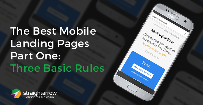
Switching up the typography—from typefaces to font sizes—is one way to make sure the right statements grab users’ attention. Emphasise the information that would explain why your target audience should take action, and downplay any information that might cause them to hesitate. The greater the benefit to you, the larger the font. Check out this mobile page for The New York Times:

Sorted: Largest to Smallest Fonts
- Basic (the product/subscription)
- Choose how you want... (call to action message)
- Starting as low as 99 cents (the promo)
- The New York Times (brand)
- Cancel anytime (part of the promo)
- Try 4 Weeks For 99 cents (call to action button) small but very visible
- See details (link to read more)
- only $3.75/week thereafter (you don't want them to know this but you are legally required to tell them)
According to this guide from Google, the recommended base font size is 16 CSS pixels. The next step would be to use sizes relative to the base size to define the typographic scale i.e. small, medium, and large.
With this, when you build the landing page, remember tip one (keep is super short) and tip two (your call to action) in mind. Once you know all the information you need to put on your landing page and design it to fit the right size on a mobile phone screen, you can then prioritise and decide which texts need to be larger and smaller to make.
Finally, make sure the customers you want can find their way to your landing pages. Find out how strong your website's presence is with our free SEO audit:

Comments