In our last post, we laid out three basic rules for creating an effective mobile landing page: keeping it short, emphasizing a CTA, and using typography to your advantage.
In this follow-up, we provide some technical advice on getting your mobile LPs into the best shape possible. After all, even the best content and aesthetics could fall apart if a page isn’t properly designed for mobile devices.
Before diving into that, let’s be clear on the meanings of two terms that tend to confuse: responsive web design (RWD) and mobile first. Both are approaches to making effective web pages for both mobile and desk- or laptop, but each uses different techniques. RWD usually achieves this by resizing, hiding, or moving the content according to the kind of device used to view it. On the other hand, Mobile First involves making separate versions of web pages for mobile and desktop.
The bottom line is that each approach has its own unique challenges. Depending on your intended users, you might design for mobile first or, typical for RWD, design for desktop and then adapt.
Here are my two cents as a developer. Having worked with a couple number of sites, I believe RWD is generally better than mobile first. Part of the reason for this is that Google, the most popular and largest search engine, prefers websites to be mobile responsive.
That said, while search rankings are important, they’re only one consideration. When you commit to an approach to designing pages,it pays to be thorough. So when you’re thinking of which to choose, keep the following points in mind:
I. Find the ideal breaking point
Developers and designers tend to build websites that is focused around some devices’ specific width. Mobile devices vary in display width, however, such that several kinds of mobile display are possible--some might even display the desktop version of the landing page.
With the rate at which new devices--and display sizes--enter the market, it would be counterproductive to repeatedly update the a page’s layout to accommodate new formats. So instead of focusing on the device width-specific breakpoint, focus on the content-specific breakpoint.
Any time the content of your mobile landing page stops being easy to read, (e.g. too much font size, orphaned word at the end of a paragraph, etc) that’s the best time to use breakpoint on that specific width.
II. Less is more
Sometimes, optimising a page means reducing its dimensions or elements. It’s always good design practice to trim things down to the essentials, so optimising a page in this way shouldn’t have to sacrifice any value delivered to users.
One example: using high quality images may be tempting, but it’s not always advisable on mobile. Rather, think in terms of web image formats: 1) GIF: used for logos, icons, and images from vector objects that are less than 256 in colour; 2) JPG: commonly used for photos and gradients used for vector images; and (3) PNG: best used when the image has transparency and has large amounts of colour. Image compression allows you to reduce file size with minimal loss of quality, and you’ll find a number of online tools can execute it.
More and more companies are adapting their logos for a wider variety of uses, moving from elaborate wordmarks to simple, signature icons. Check out this comprehensive article by Evan Brown on just how they pull it off.
Providing readers an excellent experience on mobile can also mean cutting off some copy. As long as the message gets across, even a few words will suffice. In this case, brevity and wit are your best bet.
III. Format and function
Another trick to making responsive LPs is getting the composition or format of the elements just right. For instance, leaving some breathing room between the elements of your LP--copy, images, form and CTA--can make it easier to structure. It also increases readability across all devices, which is especially important on smaller displays.
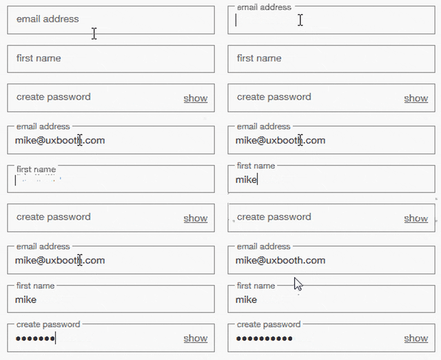
Another mobile-friendly method is using more concise forms. Applying efficient UX designs on mobile forms is good way to go.
You could take all these methods and put them into pre-made LP templates. Invest time in building beautiful page templates and they’ll serve you well in the long run. They reduce the turnaround time for publishing mobile landing pages, and can be quickly customised later on to suit clients’ particular needs.
Key takeaways
- Responsive Web Design (RWD) approach in creating mobile landing pages is increasing in popularity instead of mobile first.
- Instead of focusing on the device width specific breakpoint, focus on the content specific breakpoint.
- As much as possible, reduce image file size without sacrificing too much quality.
- If applicable, apply responsive logo.
- Using concise, witty copy is an effective way of shortening your content.
- Give breathing room for the users. Maximise the empty space.
- Use efficient UX design on forms.
- Create page templates in advance to reduce turnaround time.


Comments